Australia football team kit history: How the Socceroos changed their look over the decades?
The Australian national football team, famously known as the Socceroos, possesses one of the most vibrant and recognizable identities in the sports world. When fans investigate the Australia football kit history on Livescore808, they encounter a narrative of bold color choices reflecting the heart of the outback. Unlike many nations that use their flag colors, Australia pioneered the use of green and gold to represent the golden wattle, the national floral emblem.
From early experimentation to the sophisticated, high-performance kits of the modern era, each jersey has served as a symbol of a resilient "Aussie" spirit, energetic and unafraid to challenge the world's elite. This article explores the defining stages of the Socceroos' kit, detailing the legendary designs and the historic tournaments where these golden shirts became icons of national pride.
Australia football team kit history
The green and gold legacy and the choice of identity
Australia’s primary colors, deep gold and forest green, have been a mainstay since the 1970s, representing a strategic decision to forge a distinct identity separate from the red, white, and blue of the national flag. The gold represents the sun and the golden wattle flower, while the green symbolizes the vast Australian landscape, forests, and wetlands. This unique palette has fostered a powerful "Golden Sea" of supporters worldwide.
While early manufacturing featured brands like Umbro and Adidas, the partnership with Nike since 2004 has defined the modern era. These designs blend heritage with innovation, often incorporating indigenous motifs and advanced cooling technologies to support the team in diverse climates.
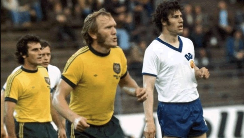
1974: The pioneering spirit (1974 World Cup)
The 1974 jersey holds a sacred place in Australian football history as the first uniform ever worn by the nation at a World Cup finals. Featuring a bright yellow body with a classic V-neck and deep green trim, this kit embodied the bold 1970s aesthetic. It was the armor for pioneers like Johnny Warren and captain Peter Wilson, who famously declared that "We, Socceroos can do the impossible."
While the results in West Germany were modest with only one point and no goal scored, the return to white home socks and the iconic coat of arms shield laid the foundation for the green and gold identity that has defined Australian pride for over half a century.
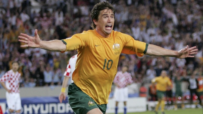
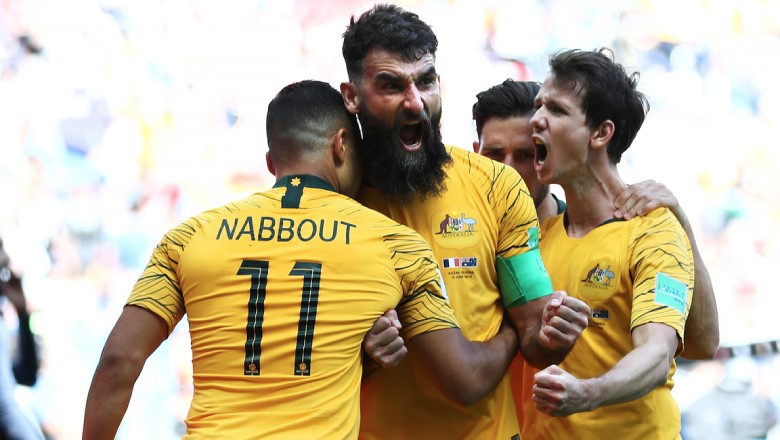
2006: The golden return (2006 World Cup)
Nike’s 2006 home jersey marked the triumphant end of Australia's 32-year World Cup drought and remains one of the most beloved designs in the nation's history. Drawing inspiration from the "Total 90" era, the kit featured a classic gold body with dark green accents and a technical breathable mesh.
This was the kit worn by the "Golden Generation", including legends like Tim Cahill, Mark Viduka, and Harry Kewell, as they secured a historic victory over Japan and reached the Round of 16 in Germany. This jersey is forever tied to the moment Australia proved it could compete with the world's best.
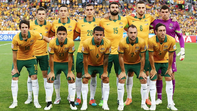
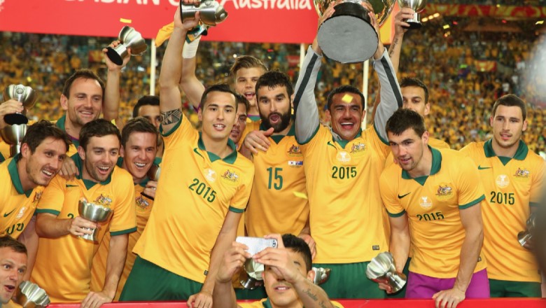
2015: The Asian champions (2015 Asian Cup)
Prioritizing a sharp, sophisticated silhouette, the 2015 kit featured a bright saturated gold body with a traditional green polo collar. This kit is forever etched in history as the uniform worn when Australia hosted and won the AFC Asian Cup.
Lifting the trophy in Sydney while wearing this professional, clean design cemented Australia's successful transition into the Asian football confederation. The jersey's minimalist style reflected the maturity of a squad that had finally claimed its place as a regional powerhouse.
2018: The feathered tribute (2018 World Cup)
For the 2018 tournament in Russia, Nike introduced a bold design featuring unique "sea eagle" graphics on the sleeves. The sharp graphic patterns were specifically inspired by the wings of the Australian sea eagle, adding a dynamic and aggressive edge to the traditional gold shirt.
This departure from minimalist templates represented the speed of the modern squad and was intended to honor the battle cry issued before the 2005 qualification against Uruguay. The kit was highly praised for its artistic flair and its successful attempt to incorporate Australian wildlife into the team's visual narrative.
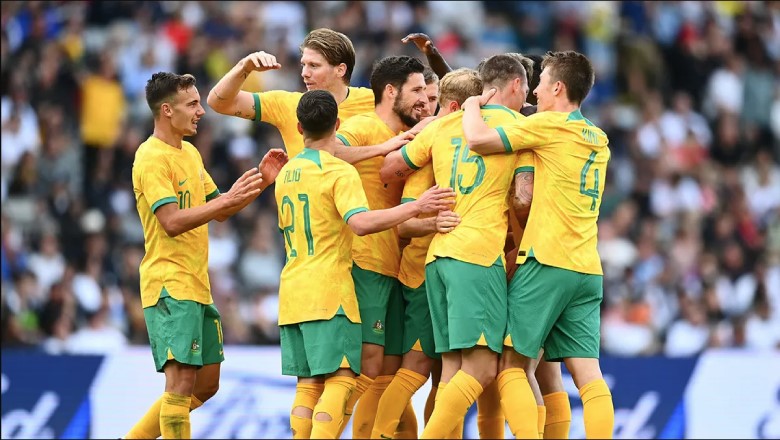
2022: The outback aesthetic (2022 World Cup)
The 2022 World Cup kit took an organic approach, featuring a "University Gold" base with a tonal marbling effect meant to mimic the rugged Australian outback and the swirling sands of the desert. This unique texture symbolized the fighting spirit of the current generation.
Paired with "Green Noise" shorts, this kit became the armor of a team that surprised the world by reaching the knockout stages in Qatar. The jersey successfully combined a centenary celebration of the Socceroos with advanced "Aero-FIT" performance cooling technology to handle the intense heat of the tournament.
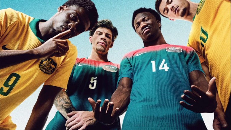
2026: The high-tech future (2026 World Cup)
As Australia prepares for the 2026 campaign in North America, the newest design focuses on sustainability and digital innovation. The home kit draws direct inspiration from the iconic 2006 design and the legendary "Total 90" era, celebrating two decades of Australian dominance on the world stage.
Utilizing 100% recycled textile waste through cutting-edge chemical recycling, the 2026 kit features visible Aero-FIT zones for maximum airflow. This jersey leads the next generation of Socceroos, representing a full-circle return to their roots while embracing the technological requirements of the modern athlete.
The narrative of the Australia football kit history is one of bold identity and unwavering pride. By tracking these iconic designs through the years, it is clear that the green and gold colors have become more than just a uniform; they are a beacon of Australian spirit.
From the breakthrough in 1974 to the regional dominance in 2015 and the sustainable future of 2026, the Socceroos continue to wear their heart on their chest. As the global game evolves, the Australian kit remains a unique and stylish constant, proving that a nation’s history and landscape are the best inspirations for success on the pitch.
Stay updated with the latest football news and detailed analysis of Australia’s journey to the 2026 World Cup by visiting livescore808.mobi today.
The Most Popular
-
 How many months in a La Liga season? Inside the intense annual calendar of Spanish giants
 -
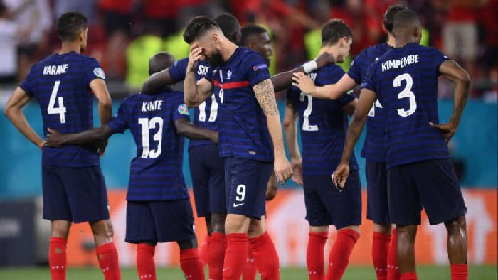 5 France biggest losses in football history: Three of them came from an arch-rival
 -
 All Messi records that you need to know: The whole world El Pulga had conquered!
 -
 Top 17 players who played for both Chelsea and Arsenal: No.1 signing triggered a bitter lawsuit between two London clubs
 -
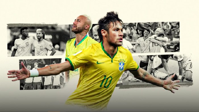 What position does Neymar play? “Little Pelé” and the playing style behind a legend
 -
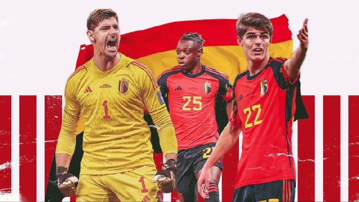 Belgium national football team players World Cup 2026: 10 Red Devil stars ready to steal the show this summer
 -
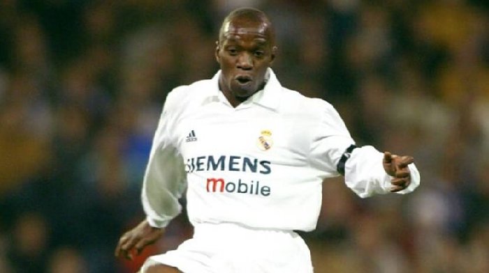 Why did Makelele leave Real Madrid? Zidane’s warning and the dawn of the first Galacticos downfall
 -
 How much did Real Madrid pay for Beckham? Blockbuster signing with influence far beyond football
 -
 How much did Man City pay for Jack Grealish? The journey from England’s most expensive player to a forgettable flop
 -
 How much did PSG pay for Neymar? The record that world football still hasn’t managed to break